Presentation of Data
- Contents presented here have been taken from the book Introduction to Statistical Theory Part 1 by Professor Sher Muhammad Chaudhry. Code snippets for creating graphs in R have been taken from https://www.tutorialspoint.com>
- This document will be updated incrementally. Make sure you have downloaded the latest copy from the LMS.
Presentation of Data
Introduction
The device of gathering data often results in a massive volume of statistical data, which are in the form of individual measurements or counts. It is difficult to learn anything by examining the unorganized data which is more often confusing than clarifying. The mass of data is therefore to be organised and condensed into a form that can be more rapidly and easily understood and interpreted. For this purpose, techniques of classification, tabulation and graphic displays are presented in this chapter.
Classification
The term classification is defined as the process of dividing a set of observations or objects into classes or groups in such a way that (i) observations or objects in the same class or group are similar, (ii) observations or objects in each class or group are dissimilar to observations or objects in other class or group. Classification is thus the sorting of data into homogeneous classes of groups according to their being alike or not. When the data are sorted according to one criterion only, it is called a simple classification or one-way classification.
Classification is called a two-way classification when the data are sorted according to two criteria. A manifold classification or cross-classification is made according to several criteria.
Data may also be classified according to qualitative, temporal and geographical characteristic. Arrangement of data according to the values of a variable characteristic is called a distribution. When the defining variable is expressed in terms of location, we get a spatial or geographical distribution. Temporal arrangement of values is referred to as a time series.
Aims of Classification
The main aims of classification are:
- to reduce the large sets of data to an easily understood summary;
- to display the points of similarity and dissimilarity;
- to save mental strain by eliminating unnecessary details;
- to reflect the important aspects of the data; and
- to prepare the ground for comparison and inference.
Basic Principles of Classification
While classifying large sets of data, the following points should be taken into consideration.
- The classes or categories into which the data are to be divided, should be mutually exclusive and no overlap should exist between successive classes. In other words, classes should be arranged so that each observation or object can be placed in one and only one class.
- The classes or categories should be all inclusive. All inclusive classes are classes that include all the data.
- As far as possible, the conventional classification procedure should be adopted.
- The classification procedure should not be so elaborate as to lead to trivial classes nor it should be so crude as to concentrate all the data in one or two classes.
Tabulation
Tabulation means a systematic presentation of data classified under suitable heads and subheads, and placed in columns and rows. This sort of logical arrangement makes the data easy to understand, facilitates comparisons and provides an effective way to convey information to a reader.
Types of Tables
Statistical tables are of two types, general purpose or primary tables, and specific purpose derived or text tables.
General purpose tables are large in size, extensive with vast coverage and are constructed for reference purposes.
Specific purpose tables are simpler in structure and deal with one or two criteria of classification only. Such tables are used to analyse or to assist in analyzing data.
When the classification corresponds to one, two or many criteria or characteristics, the tabulation is called single, double or manifold tabulation respectively.
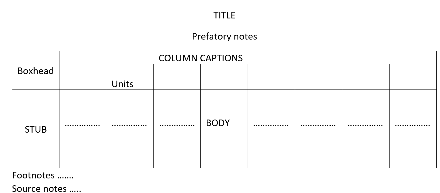
Main parts of a statistical table are the title, the boxhead, the stub, the body, one or more prefatory notes, footnotes and a source.
Main Parts of a Table and its Construction.
The main parts of a table and the general rules to be observed in constructing any table are described below:
(a) Title. A table must have a self-explanatory title, which should usually tell us the “what, where; how classified and when” of the data, in that order. Some other important points are stated below:
-
Titles should be brief in the form of phrases. Complete sentences are unnecessary.
-
Abbreviations should not be used.
-
Main titles should be in capitals throughout. Sub-titles, if any, should be in lower case letters with major words
capitalized and should indicate clearly what the table describes.
-
The different parts of a title should be separated by commas but no full-stop at the end.
-
Words in titles should not be hyphenated except when really necessary.
-
If a title necessitates the use of two or more lines, an inverted pyramid arrangement of the lines should be used.
(b) Column Captions and Boxhead. The heading of each column is called a Column Caption, while the section of a table that contains the column captions, is referred to as Boxhead. Points to note here are given below:
- The headings should be clear but concise.
-
They should be arranged in such a way that the most important characteristic is placed in the first column. The column of totals is usually placed at extreme right, but some people prefer the totals on the left.
-
only the first word in each column caption should be capitalized. No full stop should be put at the end.
-
Abbreviations, when clear, may be used.
-
Main caption should be centered over the column it is to span.
-
Extra lines should be used to avoid crowding in caption box.
-
Whenever possible, caption width should be made roughly proportional to the size of numbers to be inserted.
(c) Row Captions and Stub. The heading or title for a row, is called the Row Caption and the section containing the row captions is known as Stub. The necessary points in this respect are given below:
-
The principles for column captions apply to row captions in stub.
-
If the stub is long and has several levels of classification, the major classification should be capitalized to separate the table into parts.
-
Whenever the figures have more than four or five significant digits, the digits should be grouped in threes or fours. For example, one should write 23 178 327, not 23178327.
-
In long tables, some space should be left after every five or ten rows.
-
Totals should usually be placed at the bottom, but some prefer to place them at the top.
-
Items in the stub should be arranged so as to facilitate easy reading.
-
Every stub should have an appropriate heading describing its contents. This heading should be centered in the upper left box of the table.
(d) Prefatory Notes and Footnotes. Explanatory notes incorporated in the table beneath the title and below the body, are called prefatory notes and footnotes respectively.
Prefatory notes give additional specifications of the data indicative of items included or excluded for all data of the table, statements of the box, etc. They are placed between the title and the boxhead. The wording, should be in lower case alphabet.
Footnotes are used to clarify anything in the table by giving a fuller description, by drawing attention incompleteness or by stating any special circumstances affecting the data. The footnotes should be specific in nature. They are placed immediately below the bottom line of the table, above the source. Footnote symbols should be placed , as follows:
-
If they refer to an entire column or a set of columns, place them at the end of the appropriate caption.
-
If they refer to an entire row or a set of rows, place them at the end of the appropriate stub title.
-
If they refer to a single cell in the table, place beside the cell entry in the body of the table.
The footnotes should be indicated either by lower case alphabet enclosed in parentheses or by symbols as *, †, ‡ etc. never by a number.
(e)Source Notes. Every table should have a source note, unless the table is an original tabulation and its source is clear from the context. It is placed immediately below the table and below the footnotes, if any. The source notes must include the compiling agency, publication, date of publication and page as they are used as a means of verification and reference.
(f)Body and Arrangement of Data. The body of a table is the most important part,, which contains the entire data arranged in columns and rows. A rough-sketch enables us to have an idea about the number of columns and rows required.
Arrangement of the data is made by taking into consideration the basis of classification and the purpose of the table. Thus the data may be arranged either:
- according to the alphabetical order or ,
(ii), according to the time of occurrence or - according to location or
- according to magnitude or importance, or
- by a customary classification, e.g. classifying as men, women and children, etc. Whatever arrangements are used, the table should be neat, simple and attractive to the eye.
(g)Spacing and Rulings. A proper and judicious use of spacing and ruling enhances the effectiveness of a table and helps in separating or emphasizing certain items in it. Thick or double lines (rulings) are used for emphasis and for separating the title, the boxhead, the stub, etc., while parts under captions and related columns are separated by thin or single lines.
(h)General. There are some other considerations too, that are enumerated below:
-
A table should be simple. A complex table if possible, may be broken into relatively simple tables.
-
Units of measurements and nature of the data should be specified in title,, captions, etc. in parentheses.
-
Percentages should be clearly indicated as ‘per cent of total’ etc. and their total should invariably be shown as 100.0.
-
If the figures entered in the table are rounded off, this should be indicated in the prefatory note or in the stub or caption.
-
Zeros need not be entered.
-
Minus signs are a part of the table and precede the number.
-
The relationship of the parts to the whole should be shown by thin or heavy rulings.
-
The item or items to be emphasized should be placed in the most prominent position of the table.
The general sketch of a table is given below:
Frequency Distribution
The organization of a set of data in a table showing the distribution of the data into classes or groups together with the number of observations in each class or group is called a Frequency Distribution. The number of observations falling in a particular class is referred to as the class frequency or simply frequency and is denoted by f. Data presented in the form of a frequency distribution are also called grouped data while the data in the original form are referred to as ungrouped data. The data are said to be arranged in an array when arranged in ascending or descending order of magnitude The purpose of a frequency distribution is to produce a meaningful pattern for the overall distribution of the data from which conclusions can be drawn. A fairly common frequency pattern is the rising to a peak and then declining. In terms of its construction, each class or group has lower and upper limits, lower and upper boundaries, an interval and a middle value.
Class-limits
The class-limits are defined as the numbers or the values of the variables which describe the classes; the smaller number is the lower class limit and the larger number is the upper class limit. Class limits should be well defined and there should be no overlapping. In other words, the limits should be inclusive, i.e. the values corresponding exactly to the lower limit or the upper limit be included in that class. The class-limits are therefore selected in such a way that they have the same number of significant places as the recorded values. Suppose the data are recorded to the nearest integers. Then an appropriate method for defining the class limits without overlapping, for example, may be 10-14, 15-19, 20-24, etc. The class limits may be defined as 10.0-14.9, 15.0—19.9, 20.0—24.9, etc. when the data are recorded to nearest tenth of an integer.Sometimes, a class has either no lower clags limit or no upper class-limit. Such a class is called an open- end class. The open-end classes, if possible, should be avoided as they are a hindrance in performing certain calculations. A class indicated as 10-15 will include 10 but not 15, i.e. 10 < X < 15.
Class-boundaries.
The class-boundaries are the precise numbers which separate one class from age selection of these numbers removes the difficulty, if any, in kno ng the class to which a particular value should be assigned. A class-boundary is located midway between the upper limit of a class and the lower limit of the next higher class, e.g. 9.5-14.5, 14.5-19.5, 19.5-24.5, or 9.95-14.95, 14.95-19.95, etc. The class-boundariés are thus always defined more precisely than the level of measurements being used so that the possibility of any observation falling exactly on the boundary is avoided. That is why the class boundaries carry one more decimal place than the class limits or the observed values. The upper class boundary of a class coincides with the lower class boundary of the next class.
Class Mark
A class mark, also called class midpoint, is that number which divides each class into two equal spt practice, it is obtained by dividing either the sum of the lower and upper limits of a class, or the sum of the lower and upper boundaries of the class by 2 but in a few cases, it does not hold, particularly in modern practice of age grouping. For. purposes of calculations, the frequency in a particular class is assumed to have the same value as the class-mark or midpoint. This assumption may introduce an error, called the grouping error, but statistical experience has shown that such errors usually tend to counterbalance over the entire distribution. The grouping error may also be minimized by selecting a class (group) in such a way that its midpoint corresponds to the mean of the observed values falling in that class.
##Class Width or Interval. the class-width or interval of a class is equal to the difference between the class boundaries. It may also be obtained by finding the difference either between two successive lower class limits, or between two successive class marks) The lower limit of a class should not be subtracted from its upper limit to get the class interval. An equal class interval, usually denoted by hf or c, facilitates the calculations of statistical constants such as the mean, the standard deviation, moments, etc. That is why in practice, it is desirable to have equal class-intervals. But in some types of economic and medical data, it is wise to use unequal class-intervals on account of greater concentration of measurements in certain classes. Such class intervals usually become uniform when logarithms of class marks are taken. It should be noted that some people use the terms “class” and “class- interval” interchangeably and the width of the class is referred to as the size or length of the class-interval.
Constructing a Grouped Frequency Distribution
The following are some basic rules that should be kept. in mind when constructing a grouped frequency distribution:
-
Decide on the number of classes into which the data are to be grouped. There are no hard and fast rules for deciding on the number of classes which actually depends on the size of data. Statistical experience tells us that no less than 5 and no more than 20 classes are generally used if Use of too many classes will defeat the purpose of condensation and too few will result in too much loss of information. H.A. Sturges has proposed an empirical rule for determining the number of classes into which a set of observations should be grouped. The rule is k = 1 + 3.3 * logN, where k denotes the number of classes and N is the total number of observations. For example, if there are 100 observations, then by applying Sturges’ rule, we should have k = 1 + 3.3(2.0000) = 7.6, i.e. 8 classes Thus eight classes are required but this rule is rarely used in practice.
-
Determine the range of variation in the data, i.e. the difference between the largest and the smallest values in the data.
-
Divide the range of variation by the number of classes to determine the approximate width or size of the equal class-intervals. In case of fractional results, the next higher whole number is usually taken as the size or width of class-interval. If equal class-intervals are inconvenient or may be undesirable, then classes of unequal size are used. But in practice, intervals that are multiple of 5 or 10, are commonly used as people can understand them more readily.
-
Decide where to locate the class limit of the lowest class - and then the lower class boundary. The lowest class usually starts with the smallest data value or a number less than it. It is better if it is a multiple of class-interval. Find the upper class boundary by adding the width of the class-interval to the lower class-boundary and write down the upper class limits too, The open-end classes, i.e. classes with the lowermost or uppermost class boundary unknown, should be avoided if possible.
-
Determine the remaining class-limits and class boundaries by adding the class-interval repeatedly. The lowest class should be placed at the top and the rest should follow according to size. In some cases, the highest class is placed at the top.
-
Distribute the data into the appropriate classes. This is best done by using a “Tally-Column” where values are tabulated against appropriate classes by merely making short bars or tally marks to represent them) It is customary for convenience in counting to place the first four bars vertically and the fifth one diagonally and to leave a space. The number of tallies is then written in the frequency column. The tally column is usually omitted in the final presentation of the frequency distribution. But in case of small number of values, the actual values should be shown against each class to mitigate chances of error.
-
Finally, total the frequency column to see that all the data have been accounted for.
These rules are applied to group raw data which are assumed to be continuous. In case of discrete data which carry only integral values, the concept of a class boundary is unrealistic as there can be no points where the adjoining classes meet. In spite of this logical difficulty, when the discrete data are sufficiently large, they are treated for convenience of calculations as continuous and hence are grouped in the same way as the continuous data.
Example
Make a grouped frequency distribution from the following data, relating to the weight recorded to the nearest grams of 60 apples picked out at random from a consignment.
Data
106 107 76 82 109 107 115 93 187 95 123 125
111 92 86 70 126 68 130 129 139 119 115 128
100 186 84 99 113 204 111 141 136 123 90 115
98 110 78 185 162 178 140 152 173 146 158 194
148 90 107 181 131 75 184 104 110 80 118 82.
By scanning the data, we find that the largest weight is 204 grams and the smallest weight is 68 grams so that the range is 204—68 = 136 grams.
Suppose we decide to take 7 classes of equal size. Then size or width of the equal class interval would be 136/7 = 19.47. But we take h=20, the next integral value higher than 19.47 to facilitate the numerical work.
Let us decide to locate the lower limit of the lowest class at 65. With this choice, the class limits will be 65-84, 85-104, 105-124, …, the class boundaries become 64.5—84.5, 84.5-104.5, 104.5-124.5, …, and the class marks are 74.5, 94.5, 114.5… The grouped frequency distribution is then constructed as follows:
By listing the actual values:
| Weight | Entries | Frequency |
|---|---|---|
| 65 - 84 | 76, 82, 70, 68, 84, 78, 75, 80, 82 | 9 |
| 85 - 104 | 93, 95, 92, 86,100, 99, 90, 98, 90, 104 | 10 |
| 105 - 124 | 106, 107, 109, 107, 115, 123, 111, 119,115, | 17 |
| 113, 111, 123, 115, 110, 107, 110,118 | ||
| 125 - 144 | 125, 126, 130, 129, 139, 128, 141, 136, 140, 131 | 10 |
| 145 - 164 | 162, 152, 146, 158, 148 | 5 |
| 165 - 184 | 178, 173, 181, 184 | 4 |
| 185 - 204 | 187, 186, 204, 185, 194 | 5 |
| Total | 60 |
This table is sometimes known as an entry table. The values against each class may be arranged in an array.
By using a tally column
| Weight | Class Boundary | Class Marks | Tally | Frequency |
|---|---|---|---|---|
| 65 - 84 | 64.5 - 84.5 | 74.5 | IIIII IIII | 9 |
| 85 - 104 | 84.5 - 104.5 | 94.5 | IIIII IIIII | 10 |
| 105 - 124 | 104.5 - 124.5 | 114.5 | IIIII IIIII IIIII II | 17 |
| 125 - 144 | 124.5 - 144.5 | 134.5 | IIIII IIIII | 10 |
| 145 - 164 | 144.5 - 164.5 | 154.5 | IIIII | 5 |
| 165 - 184 | 164.5 - 184.5 | 174.5 | IIII | 4 |
| 185 - 204 | 184.5 - 204.5 | 194.5 | IIIII | 5 |
| Total | 60 |
Cumulative Frequency Distribution.
The total frequency of a variable from its one end to a certain value (usually upper class boundary in grouped data), called the base, is known as the cumulative frequency, less than or more than the base of the variable.A table that shows the cumulative frequencies, is called a cumulative frequency distribution. The cumulative frequency of the last class is the sum of all frequencies in the distribution. If the cumulation process is from the lowest value to the highest, it is referred to as “a less than” type cumulative frequency distribution. For example, let us consider a frequency distribution having k classes, each of width h. Let us denote the midpoint of the ith class by xi With frequency fi such that \( \sum_{i=1}^{k}f_i = n \)
Now the lower class-boundary of the first group is x1—h/2 and the upper class boundaries are xi + h/2, (i=1, 2, …., k). The cumulative frequency distribution is then obtained by adding each successive frequency to the cumulative total of frequencies for the preceding classes as shown below:
| Class boundary | Cumulative Frequency |
|---|---|
| less than x1 — h/2 | 0 |
| less than x1 + h/2 | f1. |
| less than x2 + h/2 | f1 + f2 |
| less than x3 + h/2 | f1 + f2 + f3 |
| less than xk + h/2 | ∑fi = n |
It should be noted that a less than type cumulative frequency distribution starts with the lower class boundary of the first group indicating that there is no frequency below x 1 − h/2.
When the frequencies are cumulated from the highest value to the lowest value, it is called a “more than” type cumulative frequency.
If the class frequencies against various classes are divided by the total frequency, we get the relative frequencies which always add to one. The class frequencies may also be expressed as Percentages, the total of which would be 100. A percentage cumulative distribution is useful to read off the percentage of values falling between certain specified values.
Example:
Construct i) a “less than” type cumulative distribution and (ii) a “more than” type cumulative distribution from the from the frequency distribution of weights of 60 apples of Data.
- A “less than” type cumulative frequency distribution is shown below:
| Weight (grams) | Cumulative Frequency(F) |
|---|---|
| Less than 64.5 | 0 |
| Less than 84.5 | 9 |
| Less than 1045 | 19 |
| Less than 124.5 | 36 |
| Less than 144.5 | 46 |
| Less than 164.5 | 51 |
| Less than 184.5 | 55 |
| Less than 204.5 | 60 |
- A “more than” type cumulative frequency distribution is given below:
| Weight (grams) | Cumulative Frequency(F) |
|---|---|
| More than 64.5 | 60 |
| More than 84.5 | 51 |
| More than 104.5 | 41 |
| More than 124.5 | 24 |
| More than 144.5 | 14 |
| More than 164.5 | 9 |
| More than 184.5 | 5 |
| More than 204.5 | 0 |
Stem-and-Leaf Display
A clear disadvantage of using a frequency table is that the identity of individual observations is lost in grouping process. To overcome this drawback, John Tukey (1977) introduced a technique known as the Stem-and-Leaf Display. This technique offers a quick and novel way for simultaneously sorting and displaying data sets where each number in the data set is divided into two parts, a-Stem and a Leaf. A stem is the leading digit(s) of each number and is used in sorting, while a leaf is the rest of the number or the trailing digit(s) and shown in display. A vertical line separates the leaf (or leaves) from the stem. For example, the number 243 could be split two ways:
| leading digit | trailing digits |
|---|---|
| 2 | 43 |
| stem | leaf |
OR
| leading digit | trailing digit |
|---|---|
| 24 | 3 |
| stem | leaf |
All possible stems are arranged in order from the smallest to the largest and placed on the left hand side of the line.
The stem-and-leaf display is a useful step for listing the data in an array, leaves are associated with the stem to know the numbers. The stem-and-leaf table provides a useful description of the data set and can easily be converted to a frequency table. It is a common practice to arrange the trailing digits in each row from smallest to highest.
Example:
The ages of 30 patients admitted to a certain hospital during a particular week were as follows:
48, 31, 54, 37, 18, 64, 61, 43, 40, 71, 51, 12, 52, 65, 53 42, 39, 62, 74, 48, 29, 67, 30, 49, 68, 35, 57, 26, 27, 58.
Construct a stem-and-leaf display from the data and list the data in an array.
A scan of the data indicates that the observations range (in age) from 12 to 74. We use the first (or leading) digit as the stem and the second (or trailing) digit as the leaf. The first observation is 48,, which has a stem of 4 and a leaf of 8, the second a stem of 3 and a leaf of 1, etc. Placing the leaves in the order in which they appear in the data, we get the stem-and-leaf display as shown below:
| Stem (leading digit) | Leaf (trailing digit) |
|---|---|
| 1 | 8 2 |
| 2 | 9 6 7 |
| 3 | 1 7 9 0 5 |
| 4 | 8 3 0 2 8 9 |
| 5 | 4 1 2 3 7 8 |
| 6 | 4 1 5 2 7 8 |
| 7 | 1 4 |
To get the array, we associate the leaves in order of size with the stems as shown below:
12, 18, 26, 27, 29, 30, 31, 35, 37, 39, 40, 42, 43, 48, 48, 49, 51, 52, 53, 54, 57, 58, 61, 62, 64, 65, 67, 68, 71, 74.
Graphical Representation
Tabulation, we know, is a good method of condensing and representing statistical data in a readily understandable form, but many people have no taste for figures. They would prefer,a way of representation where figures could be avoided. This poses is achieved by the presentation of statistical data in a visual form“ The visual display of statistical data in the form of points, lines, areas and other geometrical forms and symbols is in the most general terms known as Graphical Representation. Statistical data can be studied with this method without going through figures, presented in the form of tables.
Such visual representation can be divided into two main groups, graphs and diagrams to be described in the sections that follow. The basic difference between a graph and a diagram is that a graph is a representation of data by a continuous curve, usually shown on a graph paper while a diagram is any other one, two or three–dimensional form of visual representation.
Diagrams
Diagrammatic representation is best suited to spatial series and data split into different categories. Whenever a comparison of the same type of data at different places is to be made, diagrams will be the best way to do that. Diagrammatic representation has several advantages over tabular representation of figures. Beautifully and neatly constructed diagrams are more attractive than simple figures. Diagrams, being a visual display, leave more effective and long lasting impression on the mind of a reader. They make unwieldy data intelligible at a glance. Comparison is made easier with diagrams. Diagrams have some disadvantages too. Diagrams are less accurate than tables; cost money and time and the amount of information conveyed is limited. However, this method of representation is excessively used in business and administration.
Different types of diagrams or charts commonly used for displaying statistical data are described below:
-
Linear or One-Dimensional Diagrams. They consist of Simple Bars, Multiple Bars and Component Bar charts. Here the values are represented only by one dimension, generally the length of the bar.
-
Areal or Two-Dimensional Diagrams. They consist of Rectangles, Sub-divided Rectangles and Squares, the areas of which are proportional to the values of the given quantities. This device is used to represent data having moderately large variations.
-
Cubic or Three-Dimensional Diagrams. They are in the form of Cubes and Cylinders, whose volumes are proportional to the values they represent. These diagrams are used when the variation among the values of the data to be portrayed is so large that even the square roots of the values concerned fail to reduce the variation appreciably.
-
Pie-Diagrams. They are in the form of Circles and Sectors. Here the areas of circles or sectors are in proportion to the values they represent or compare.
-
Pictograms. They consist of pictures or small symbolic figures representing the statistical data. A pictogram is an effective way of visual comparisons. For example, we can compare the armed strength of various countries by drawing pictures of the number of soldiers, where each pictorial soldier may denote, say, 1,000 soldiers. In a similar way, the production of wheat can be compared by means of the pictures of wheat bags of a specified size. It is essential to repeat the pictures a number of times to represent the differences in magnitudes.
While drawing diagrams, the following points should be kept in mind:
-
An appropriate scale consistent with the size of paper available and the size of the data to be represented, should be chosen and indicated either at the side or at the bottom of the diagram. This scale must start at zero.
-
A diagram like a table, must have a title, which should be brief and self-explanatory. A key, footnote or source will also be necessary.
-
A diagram should be shaded, coloured or cross-hatched to show the different parts, if any.
-
Lettering should be shown horizontally.
Simple Bar Chart.
A simple bar chart consists of horizontal or vertical bars of equal widths and lengths proportional to the values they represent. As the basis of comparison is linear or one-dimensional, the widths of these bars have no significance but are taken to make the chart look attractive. The space separating the bars should not exceed the width of the bar and should not be less than half of its width. The bars should neither be exceedingly long and narrow nor short and broad. The vertical bar chart is an effective way for presenting a time series and qualitatively classified data whereas horizontal bars are useful for geographical or spatial distributions. The data when do not relate to time, should be arranged in ascending or descending order before charting.
Creating a Simple Bar Chart using R
R uses the function barplot() to create bar charts. R can draw both vertical and horizontal bars in the bar chart. In bar chart each of the bars can be given different colors.
Syntax The basic syntax to create a bar-chart in R is −
barplot(H,xlab,ylab,main, names.arg,col)
Following is the description of the parameters used −
- H is a vector or matrix containing numeric values used in bar chart.
- xlab is the label for x axis.
- ylab is the label for y axis.
- main is the title of the bar chart.
- names.arg is a vector of names appearing under each bar.
- col is used to give colors to the bars in the graph.
Example
Years <-c(1965, 1966, 1967, 1968, 1969)
Turnover <-c(35000, 42000, 43500, 48000, 48500)
barplot(Tunrover, names.arg=Years, xlab ="Years", ylab="Turnover",
col="blue",
main=" Bar Diagram Showing the Turnover of a company for 5 years",
border="red")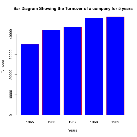
Years <- c(1965, 1966, 1967, 1968, 1969)
Turnover <- c(35000, 42000, 43500, 48000, 48500)
barplot(Turnover, names.arg=Years, xlab = "Years", ylab= "Turnover",
                col="blue",
                horiz=TRUE,
                main=" Bar Diagram Showing the Turnover of a company for 5 years",
                cex.main=0.7,
                border="red")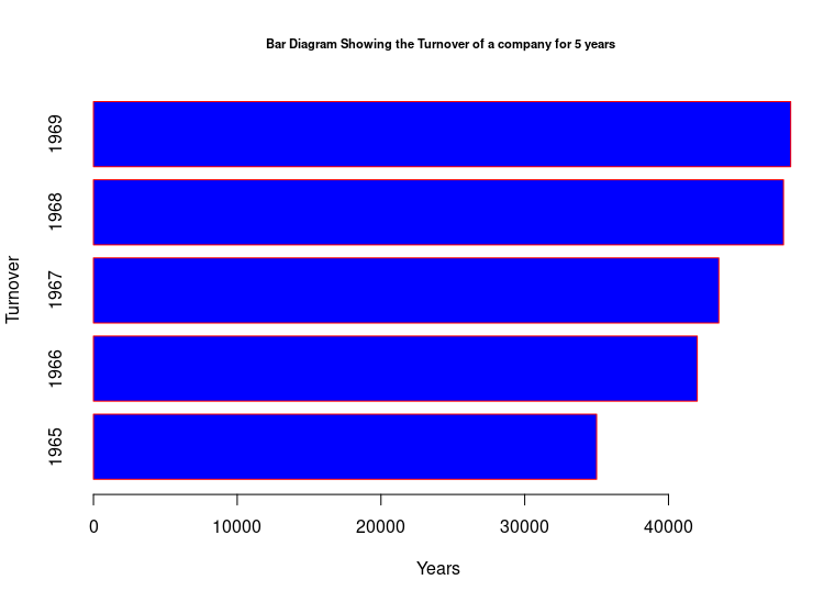
Multiple Bar Chart
A multiple bar chart shows two or more characteristics corresponding to the values of a common variable in the form of grouped bars, whose lengths are proportional to the values of the characteristics, and each of which is shaded or colored differently to aid identification. This is useful for comparison of two or three kinds of information. For example imports, exports, and productions of a country can be compared from year to year by grouping the three together.
Example
years <- c('1965-66', '1970-71', '1975-76')
area <- c(2866,3233,3420)
production <- c(1588, 2229,1937)
df <- data.frame(years, area, production)

par(mar=c(4,4,4,4), xpd=TRUE)
colors <- c("red", "blue")

barplot(cbind(area,production) ~ years,
         data=df, beside=TRUE,
         col=colors,ylim=c(0,3500),
         main="Area and production of Cotton in Punjab",
        cex.main=0.7
       )
legend("topright", inset=c(-0.2,0),
       c("area", "production"), cex=0.5,  fill = colors)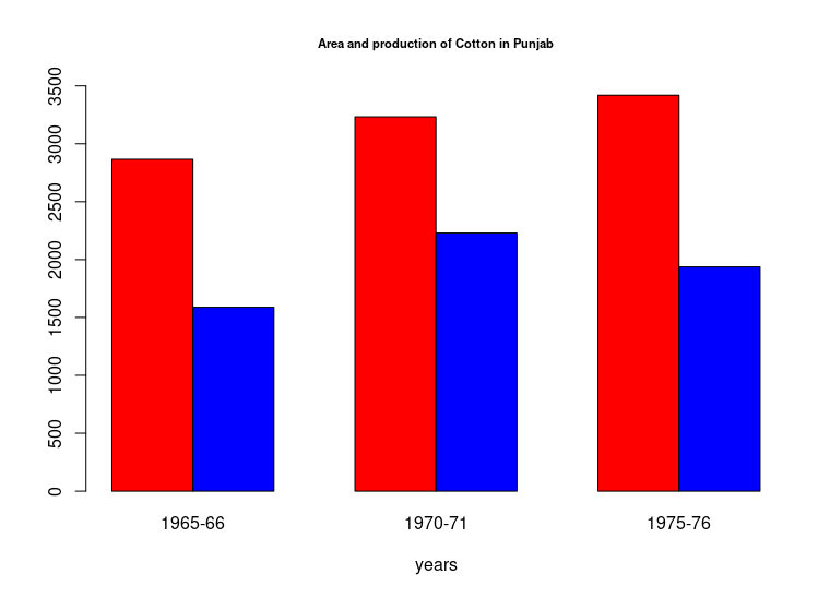
Component Bar Chart
A component bar chart is an effective technique in which each bar is divided into two or more sections, proportional in size to the component parts of a total being displayed by each bar. The various component parts shown as sections of the bar, are shaded or colored differently to increase the overall effectiveness of the diagram. Component bar charts are used to represent the cumulation of various components of data and the percentages. They are also known as sub-divided bars.
Example Draw a component bar chart for the following data:
| Division | Both genders | Male | Female |
|---|---|---|---|
| Peshawar | 64 | 33 | 31 |
| Rawalpindi | 40 | 21 | 19 |
| Sargodha | 60 | 32 | 28 |
| Lahore | 65 | 35 | 30 |
Following is the R code to generate the plot
colors = c("red", "blue")
division = c("Peshawar", "Rawalpindi", "Sargodha", "Lahore")
Values <- matrix(c(33,31,21,19,32,28,35,30), nrow=2, ncol=4, byrow=TRUE)
par(mar=c(5,5,5,5), xpd=TRUE)
barplot(Values, names.arg = division, col= colors,
        main = "component bar chart showing population of 4 divisions",
        cex.main=0.7,
        xlab="divisions", ylab = "population", ylim = c(0,70))
legend("topright", inset=c(-0.2,0),
       c("Male", "Female"), cex=0.5, fill=colors, horiz = TRUE)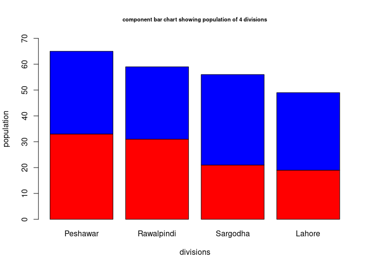
Rectangles and sub-divided rectangles
In subdivided rectangle charts the area of a rectangle is equal to the product of its length and breadth. To represent a quantity by a rectangle, both length and breadth of the rectangle are used. Sub divided rectangles are drawn for the data where the quantities along with their components are to be compared. These diagrams are generally drawn to compare the budgets of various families. In the construction of sub-divided rectangles, we are required to:
- change each component into the percentage of the corresponding total,
- draw one rectangle for each total, taking equal lengths(100 units), and breadths proportional to the totals,
- divide every rectangle so drawn into parts equal in number to the number of components. Each part shaded or colored will represent percentage size of one component.
Example Compare the budgets of families A and B with a suitable diagram.
items <- c('Food', 'Clothing', 'House Rent', 'Education', 'Litigation', 'Conventional Needs', 'Miscellaneous')
familyA <-c(24,4,4,3,2,1,2)
familyB <-c(60,14,16,6,10,6,8)
df = data.frame(items, familyA, familyB)
df
## items familyA familyB
## 1 Food 24 60
## 2 Clothing 4 14
## 3 House Rent 4 16
## 4 Education 3 6
## 5 Litigation 2 10
## 6 Conventional Needs 1 6
## 7 Miscellaneous 2 8To calculate percentages for creating sub-divided rectangles following code is required
familyAPerc <- prop.table(familyA) * 100
familyBPerc <- prop.table(familyB) * 100
df <- cbind.data.frame(items, familyA, familyAPerc, familyB, familyBPerc)
df
## items familyA familyAPerc familyB familyBPerc
## 1 Food 24 60.0 60 50.000000
## 2 Clothing 4 10.0 14 11.666667
## 3 House Rent 4 10.0 16 13.333333
## 4 Education 3 7.5 6 5.000000
## 5 Litigation 2 5.0 10 8.333333
## 6 Conventional Needs 1 2.5 6 5.000000
## 7 Miscellaneous 2 5.0 8 6.666667To create the plot following code is used:
subdf <- df[, c(3,5)]
par(xpd=T, mar=c(5,4,1.4,0.2))
barplot(as.matrix(subdf),  width=c(0.4, 1.2), legend.text = df$items, cex.main=0.6,
        args.legend = list(x="bottom", ncol=4, cex=0.6, bty='n', inset=-0.3))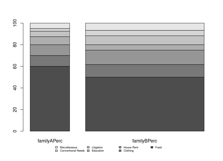
Pie Diagrams
A pie diagram, also known as sector diagram, is a graphic device consisting of a circle divided into sectors or pie-shaped pieces whose areas are proportional to the various parts into which the whole quantity is divided. The sectors are shaded or colored differently to show the relationship of parts to the whole. If space permits, the descriptive titles of the constituent parts should be placed horizontally on each sector, otherwise a key becomes necessary. It is used as an alternative to a component bar chart.
Example
x <-  c(50, 30, 20,15,35)
labels <-  c("food","clothing","house rent","fuel & light", "miscellaneous")
piepercent<- round(100*x/sum(x), 1)
pie(x, labels = piepercent, main = "Pie Diagram",col = rainbow(length(x)))
legend("topright", labels, cex = 0.8, fill = rainbow(length(x)))
GRAPHS
As already stated, diagrams are useful for representing spatial series. Diagrams fail when we want to represent a statistical series spread over a period of time, or a frequency distribution or two related variables in visual form. For such representations, graphs are employed.
Graphs present the data in a simple, clear and effective manner, facilitate comparison between two or more than two statistical series, and help us in appreciating their significance readily. Another advantage of graphs is that they provide an overall picture of a statistical series. Graphs are also sometimes used to make predictions and forecasts. Certain partition values can also be located graphically. But graphs are less accurate as they do not give minute details. Moreover, they cost considerable expenditure and time.
Construction of Graphs
In the construction of a graph, the first step is to take a starting point, known as the origin, in the left-hand bottom corner of the graph paper. Two straight lines perpendicular to each other are drawn through the origin. The horizontal line is called the X-axis or abscissa and the vertical line is labelled as Y-axis or ordinate. The two lines together are known as co-ordinate axes. Some suitable scales are selected along X-axis and Y-axis. Independent variable is taken along X-axis and dependent variable along Y-axis. Points are plotted and joined to get the required graph.
While constructing a graph, the following points should be kept in mind:
A scale and the form of representation is to be selected in such a way that the true impression of the data to be represented is given by the graph.
Every graph must have a clear and comprehensive title at top. Where necessary, sub-titles should be added.
The source of the data must be given. A key and footnotes should be provided when necessary.
The independent variable should always be placed on the horizontal axis.
The vertical scale should always begin with zero, otherwise the graph will give a false impression. If, however, the first item of the data is quite large, a scale-break should be shown between zero and next member.
The horizontal axis does not have to begin with zero unless of course, the independent variable or the lower limit of the first class interval is zero.
The axes of the graph should be properly labelled. Labels should clearly state both the variable and the units, e.g. “Distance” and “Kilometre”. “Sales” and “Rupees”, etc.
Curves if more than one, must be clearly distinguished either by different colours or by differentiated lines (solid, dashed, dot dashed).
The graph should not be loaded with too many curves.
Graphs can be divided into two main categories, namely:
- Graphs of Time-Series or Graphs of Historical Data, and
- Graphs of Frequency Distributions. The important graphs of frequency distributions are Histogram, Frequency Polygon, Frequency Curve and the Cumulative Frequency Curve or Ogive.
Graph of Time Series—Historigram
A curve showing changes in the value of one or more items from one period of time to the next is known as the graph of a time series. This curve is also called a Historigram. Thus a historigram displays variations in time series dealing with prices, production, imports, population, etc. To construct a historigram, time is taken along X-axis and the values of the variable along Y-axis. Points are plotted and are then connected by means of Straight line segments to get the “Historigram”.
Example: Following table gives the number of cars produced in Germany during the years 1929-1936. Draw a suitable graph.
| Years | No of Cars |
|---|---|
| 1929 | 98 |
| 1930 | 74 |
| 1931 | 68 |
| 1932 | 50 |
| 1933 | 99 |
| 1934 | 172 |
| 1935 | 245 |
| 1936 | 302 |
Plotting a time series in R is very easy, following code snippets prepares the example data and plots it using the plot function:
NoCars <- c(98,74,68,50,99,172,245,302)
timeSeries <- ts(NoCars, start=c(1929,1), end=c(1936,1), frequency = 1)
plot(timeSeries, main="Historigram", xlab="year", ylab="Number of Cars")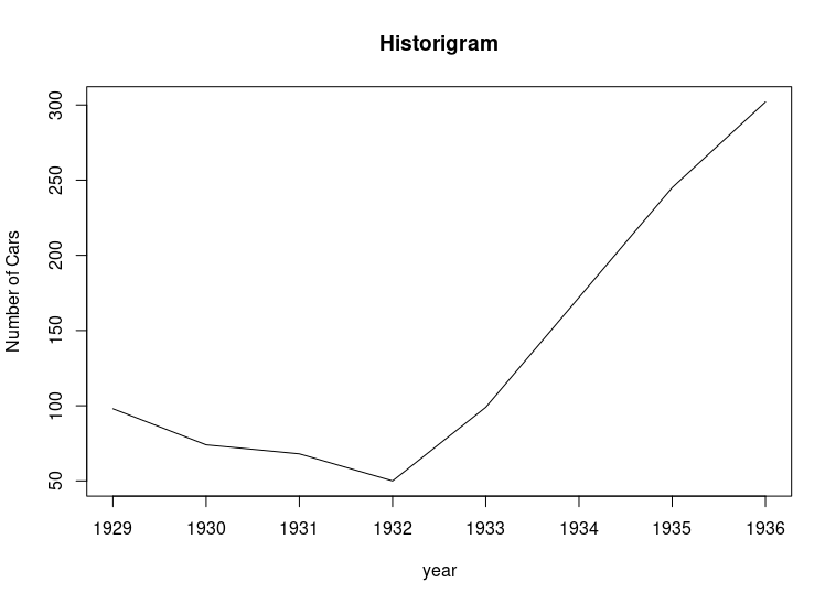
Histogram
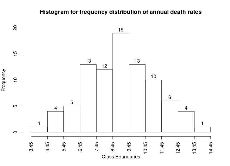
A histogram consists of a set of adjacent rectangles whose bases are marked off by class boundaries (not class limits) on the X-axis and whose heights are proportional to the frequencies associated with respective classes. The area of each rectangle represents the respective class frequencies. This is one of the most important graphical representation of a frequency distribution. When the class-intervals are equal, the rectangles all have the same width and their heights directly represent the class frequencies, that is they are numerically proportional to the frequencies in the respective classes.
Example: Given below is the data and its frequency distribution of mean annual death rates per 1,000 at ages 20-65 in each of 88 occupational groups.
sampleData <-c(7.5, 9.7, 10.3, 10.6,7.7, 4.6, 6.8, 9.3,
8.2, 11.6,10.1, 9.1, 12.8,14.0,7.1, 8.9,
6.2, 12.6,10.0, 9.7, 8.7, 8.1, 6.6, 10.1,
8.9, 5.0, 11.1, 9.3, 5.5, 11.4,8.8, 3.9,
7.8, 10.2,6.5,  6.2, 8.6, 10.6,8.8, 6.0,
5.4, 9.2, 12.5, 10.3,9.6, 11.6,10.7,6.9,
9.4, 12.0,7.8, 6.6, 11.9,10.4,10.8,9.0,
9.9, 9.9, 6.5, 7.4, 10.4,8.1, 6.0, 8.8,
10.9, 7.3,8.7, 8.6, 7.8, 4.6, 7.9, 9.4,
10.8, 7.3,9.3, 7.7, 7.6, 6.6, 7.3, 11.4,
7.4, 8.4, 12.4,9.4, 12.1,12.8,9.3, 10.9)| Death Rates | Class boundaries | Frequency |
|---|---|---|
| 3.5 - 4.4 | 3.45 - 4.45 | 1 |
| 4.5 - 5.4 | 4.45 - 5.45 | 4 |
| 5.5 - 6.4 | 5.45 - 6.45 | 5 |
| 6.5 - 7.4 | 6.45 - 7.45 | 13 |
| 7.5 - 8.4 | 7.45 - 8.45 | 12 |
| 8.5 - 9.4 | 8.45 - 9.45 | 19 |
| 9.5 - 10.4 | 9.45 - 10.45 | 13 |
| 10.5 - 11.4 | 10.45 - 11.45 | 10 |
| 11.5 - 12.4 | 11.45 - 12.45 | 6 |
| 12.5 - 13.4 | 12.45 - 13.45 | 4 |
| 13.5 - 14.4 | 13.45 - 14.45 | 1 |
| ———— | —————— | ———- |
| Total | 88 |
The histogram of the above frequency distribution is shown below:
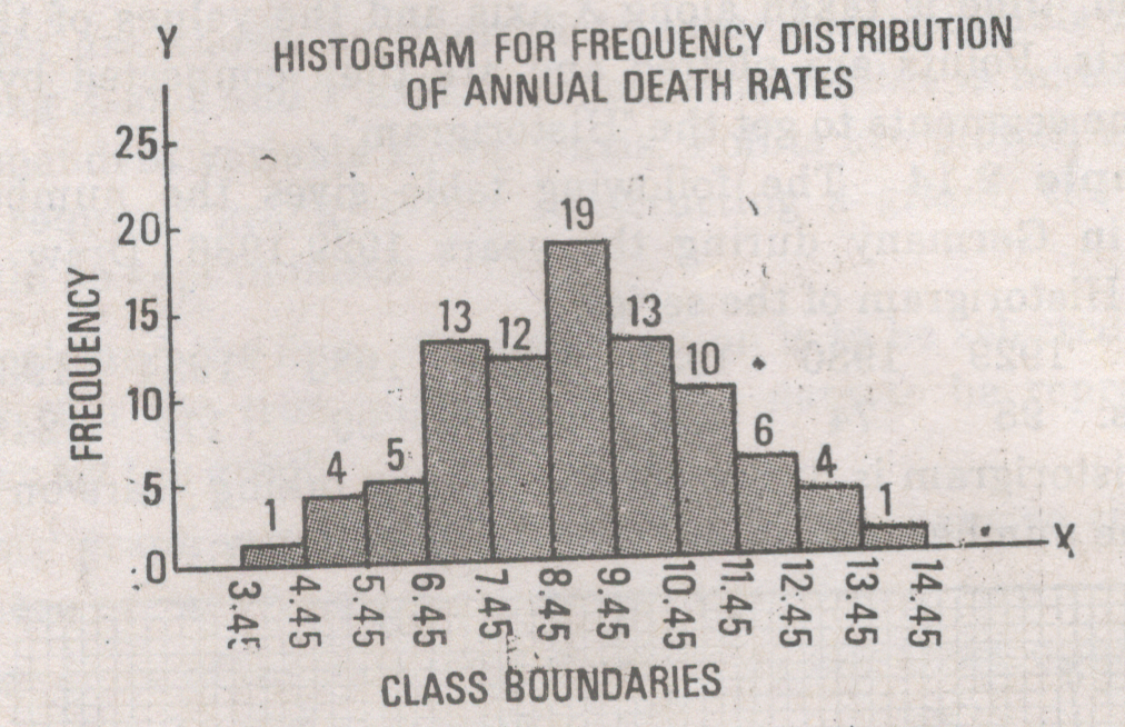
To reproduce the same histogram in R:
brks = seq(3.45, 14.45, 1)
hist(sampleData, breaks = brks, xaxt='n',
     ylim = range(0,20), labels = TRUE,
     main = "Histogram for frequency distribution of annual death rates",
     xlab="Class Boundaries")
axis(side = 1, at=brks, labels = brks, las=2)